position 속성
다양한 요소를 배치할 때 사용하는 속성
| static | 기본값. 웹 문서의 흐름에 따라 배치 |
| relative | 상대 위치로 설정. 기본 위치에서 상대적으로 얼마나 떨어져있는지 |
| absolute | 절대 위치로 설정. top, right, bottom, left로 설정. |
| fixed | 절대 위치로 설정하되, 스크롤에 영향을 받지 않는다. |
position 속성 예제)
<head>
<style type="text/css">
.sp1 {
	position: static;
	width: 300px;
	height: 50px;
	background-color: cyan
}

.sp2 {
	position: static;
	width: 300px;
	height: 50px;
	background-color: cornflowerblue;
}

.sp3 {
	position: relative;
	width: 300px;
	height: 50px;
	background-color: cornsilk;
	left: 20px;
	top: 30px;
}

.sp4 {
	position: fixed;
	width: 300px;
	height: 50px;
	background-color: navy;
	color: white;
	right: 10px;
	top: 100px;
}

.sp5 {
	position: absolute;
	width: 300px;
	height: 50px;
	background-color: rgb(162, 86, 224);
	right: 20px;
	bottom: 10px;
}
</style>

</head>
<body>
<h2>정적 위치(static)</h2>
<p class="sp1">정적 위치 설정 적용1</p>
<div class="sp2">정적 위치 설정 적용2</div>
<h2>상대 위치(relative)</h2>
<p class="sp3">상대 위치 설정 적용</p>
<h2>절대 위치(fixed)</h2>
<p class="sp4">절대 위치 설정 적용</p>
<h2>고정 위치(absolute)</h2>
<p class="sp5">고정 위치 설정 적용</p>
</body>


relative와 fixed의 다른점
relative는 원래 배치되는 위치에서부터 입력받은 값만큼 변경된다.
fixed는 스크롤에 따라서 달라진다. 창 크기에 상관없이 항상 동일한 위치에 있는다.
float 속성
요소 간의 관계를 고려하여 각 요소를 배치
| left | 요소를 왼쪽에 배치 |
| right | 요소를 오른쪽에 배치 |
| none | float 속성을 적용하지 않음. |
| inherit | 부모 요소의 속성을 그대로 적용. |
| 상속은 잘 사용하지 않고, left/right만 주로 사용함 |
float 속성 예제)
<head>
<style type="text/css">
img {
    float: right;
    margin: 0px 0px 10px 10px;
}
</style>
</head>
<body>
<p>float 속성은 웹 문서의 레이아웃을
    설계하는 과정에서 많이 사용하는 속성입니다.</p>
    <p>
    <img src="Penguins.jpg" alt="image" width="140" height="140">
    float 속성은 특정 요소를 떠 있게 해줍니다.
    여기서 '떠 있다'라는 말의 의미는 특정 요소가
    기본 레이아웃에서 벗어나 웹 문서의 왼쪽이나
    오른쪽에 이동하는 것을 말합니다.
    float 속성은 복잡한 형태의 레이아웃을
    구성하는 데 필요한 핵심 속성으로, 특정 요소가
    주변 요소와 자연스럽게 어울리도록 해줍니다.
    주의할 점은 float 속성을 사용할 때 요소의
    위치가 고정되면 안 되기 때문에 position 속성의
    absolute를 사용하면 안 됩니다.
    </p>
</body>
</html>
img의 float 속성값이 right이기 때문에 img는 항상 오른쪽에 위치한다.
clear 속성
float 속성이 적용되지 않기를 원하는 요소에 사용.
float 속성을 초기화 시킴.
| left/right | 왼쪽/오른쪽 취소 |
| both | 둘 다 취소 |
clear 속성 예제)
<head>
<style type="text/css">
.div1 {
    float: right;
    width: 100px;
    height: 50px;
    margin: 10px;
    border: 3px solid rgb(72, 231, 72);
}

.div2 {
    border: 1px solid rgb(255, 70, 70);
}

.div3 {
    float: left;
    width: 100px;
    height: 50px;
    margin: 10px;
    border: 3px solid rgb(72, 231, 72);
}

.div4 {
    border: 1px solid rgb(255, 70, 70);
    clear: both;
}
</style>
</head>
<body>
<h3>clear 없이 사용</h3>
<div class="div1">div1</div>
<div class="div2">div2 - div1 뒤에 있는 영역</div>
<p/>
<h3>clear 사용</h3>
<div class="div3">div3</div>
<div class="div4">div4 - div3 뒤에 있는 영역
    float가 초기화되어 밑으로 이동했습니다.
</div>
</body>
overflow 속성
특정 요소가 너무 커서 영역과 맞지 않을 때 내용을 제어하는 속성
| visible | 기본값. 내용이 모두 출력됨. 영역을 벗어나게 됨. |
| hidden | 벗어난 요소의 일부를 화면에서 제거 |
| scroll | 벗어난 요소의 일부를 화면에서 제거하고 영역에 스크롤바를 추가 |
| auto | scroll과 동일한데 필요한 스크롤만 출력 |
overflow 예제)
<head>
<style type="text/css">
div {
    background-color: rgb(255, 255, 255);
    width: 200px;
    height: 50px;
    border: 1px dotted black;
    overflow: auto;
}

.clearfix1 {
    width: 100%;
    overflow: visible;
}
.clearfix2 {
    width: 100%;
    overflow: hidden;
}
.clearfix3 {
    width: 100%;
    overflow: scroll;
}
.clearfix4 {
    width: 100%;
    overflow: auto;
}
</style>
</head>
<body>
<hr>
<h3>overflow를 사용하여 이미지 다 보이게 하기</h3>
<div class="clearfix1">
    <img class="img1" src="Penguins.jpg" width="170">
    Lorem ipsum dolor sit amet, consectetur adipiscing elit.  Mauris egestas rutrum placerat.
</div>
<h3>overflow를 사용하여 이미지 다 보이게 하기</h3>
<div class="clearfix2">
    <img class="img1" src="Penguins.jpg" width="170">
    Lorem ipsum dolor sit amet, consectetur adipiscing elit.  Mauris egestas rutrum placerat. Curabitur tempus nisl vel rhoncus ornare. Mauris fringilla velit sit amet ullamcorper semper. Pellentesque porttitor risus ac tempor sagittis. Sed sed tincidunt sapien. Fusce quis nunc volutpat, ullamcorper velit nec, aliquet velit. Pellentesque nec nulla vitae risus mattis gravida at a urna. Duis efficitur sapien sit amet nisl ornare, ut tempor neque pharetra. Donec tempor eros vitae sapien rutrum mattis. Proin vitae aliquam odio. Nulla ut libero ac nisl pretium tempor. Phasellus ac risus sapien. Fusce accumsan lacus a tortor dictum, sit amet tempor est pharetra. Suspendisse suscipit commodo mi, sit amet commodo turpis accumsan nec. Vestibulum rutrum facilisis quam nec faucibus.
</div>
<h3>overflow를 사용하여 이미지 다 보이게 하기</h3>
<div class="clearfix3">
    <img class="img1" src="Penguins.jpg" width="170">
    Lorem ipsum dolor sit amet, consectetur adipiscing elit.  Mauris egestas rutrum placerat. Curabitur tempus nisl vel rhoncus ornare. Mauris fringilla velit sit amet ullamcorper semper. Pellentesque porttitor risus ac tempor sagittis. Sed sed tincidunt sapien. Fusce quis nunc volutpat, ullamcorper velit nec, aliquet velit. Pellentesque nec nulla vitae risus mattis gravida at a urna. Duis efficitur sapien sit amet nisl ornare, ut tempor neque pharetra. Donec tempor eros vitae sapien rutrum mattis. Proin vitae aliquam odio. Nulla ut libero ac nisl pretium tempor. Phasellus ac risus sapien. Fusce accumsan lacus a tortor dictum, sit amet tempor est pharetra. Suspendisse suscipit commodo mi, sit amet commodo turpis accumsan nec. Vestibulum rutrum facilisis quam nec faucibus.
</div>
<h3>overflow를 사용하여 이미지 다 보이게 하기</h3>
<div class="clearfix4">
    <img class="img1" src="Penguins.jpg" width="170">
    Lorem ipsum dolor sit amet, consectetur adipiscing elit.  Mauris egestas rutrum placerat. Curabitur tempus nisl vel rhoncus ornare. Mauris fringilla velit sit amet ullamcorper semper. Pellentesque porttitor risus ac tempor sagittis. Sed sed tincidunt sapien. Fusce quis nunc volutpat, ullamcorper velit nec, aliquet velit. Pellentesque nec nulla vitae risus mattis gravida at a urna. Duis efficitur sapien sit amet nisl ornare, ut tempor neque pharetra. Donec tempor eros vitae sapien rutrum mattis. Proin vitae aliquam odio. Nulla ut libero ac nisl pretium tempor. Phasellus ac risus sapien. Fusce accumsan lacus a tortor dictum, sit amet tempor est pharetra. Suspendisse suscipit commodo mi, sit amet commodo turpis accumsan nec. Vestibulum rutrum facilisis quam nec faucibus.
</div>
</body>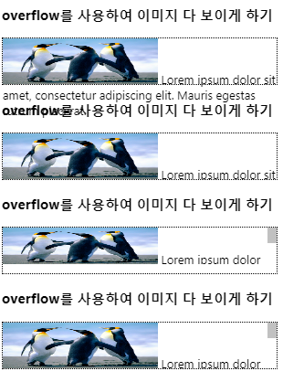
scroll과 auto의 차이점
| scroll | 수평, 수직 다 생기도록 하는 것 |
| auto | 수직만 생김 |
overflow: auto
영역의 세로길이가 지정되어 있지 않을 경우 가장 큰 요소의 크기로 영역의 크기가 결정.
overflow: auto 예제)
<heda>
<style type="text/css">
div {
    border: 3px solid green;
    padding: 5px;
    height: 50px;
}

.over {
    overflow: auto;
}

.img1 {
    float: left;
    margin-right: 10px;
}
</style>
</head>
<body>
<div class="over">
    <img class="img1" src="Penguins.jpg" width="150px">
    Lorem ipsum dolor sit amet, consectetur adipiscing elit. Mauris egestas rutrum placerat. Curabitur tempus nisl vel rhoncus ornare. Mauris fringilla velit sit amet ullamcorper semper. Pellentesque porttitor risus ac tempor sagittis. Sed sed tincidunt sapien. Fusce quis nunc volutpat, ullamcorper velit nec, aliquet velit. Pellentesque nec nulla vitae risus mattis gravida at a urna. Duis efficitur sapien sit amet nisl ornare, ut tempor neque pharetra. Donec tempor eros vitae sapien rutrum mattis. Proin vitae aliquam odio. Nulla ut libero ac nisl pretium tempor. Phasellus ac risus sapien. Fusce accumsan lacus a tortor dictum, sit amet tempor est pharetra. Suspendisse suscipit commodo mi, sit amet commodo turpis accumsan nec. Vestibulum rutrum facilisis quam nec faucibus.
</div>
</body>
</html>
전체 이미지가 다 나올수 있도록 세로길이(height)를 맞춰주기 위해 overflow를 사용함.
auto의 경우 세로 길이 지정 되어있지 않을 때는 가장 큰 요소에 따라서 세로길이(height)가 잡힘.
z-index
중첩된 요소의 계층화
z축 정렬을 위한 속성
z-index의 값이 크면 가장 상단에, 값이 작으면 가장 하단에 위치함.
z-index 예제)
<head>
<style type="text/css">
#box1 {
    position: absolute;
    top: 0px;
    left: 0px;
    width: 100px;
    height: 100px;
    background-color: rgb(255, 61, 61);
    z-index: 3;
}
#box2 {
    position: absolute;
    top: 30px;
    left: 30px;
    width: 100px;
    height: 100px;
    background-color: rgb(43, 177, 88);
    z-index: 2;
}
#box3 {
    position: absolute;
    top: 60px;
    left: 60px;
    width: 100px;
    height: 100px;
    background-color: rgb(83, 46, 247);
    z-index: 1;
}
#box2:hover { /* 마우스가 올라갔을때만 가장 위로 올라옴 */
    z-index: 10;
}
</style>
</head>
<body>
<div id="box1">박스 1번</div>
<div id="box2">박스 2번</div>
<div id="box3">박스 3번</div>
</body>
마우스를 박스2번에 올렸을 경우 z-index가 가장 크기 때문에 가장 상단에 위치한다.
table-layout
셀의 너비를 조절하는 속성 : auto(초기값), fixed (기타 : initial, inherit)
table-layout 예제)
<head>
<style type="text/css">
td, th {
    border: 1px solid black;
}

#tb1 {
    border: 2px solid red;
    table-layout: auto;
}

#tb2 {
    border: 3px dotted teal;
    table-layout: fixed;
}
</style>
</head>
<body>
<h3>table-layout auto</h3>
<table id="tb1">
    <tr>
        <th>table-layout auto</th>
        <td>내용 분량에 따라 자동으로 조절. 더 내용이 생기면...</td>
    </tr>
</table>
<hr>
<table id="tb2" width="250px">
    <tr>
        <th>table-layout fixed</th>
        <td>내용 분량과 상관없이 고정</td>
    </tr>
</table>
fixed 속성값은 창 크기와 관계없지만 auto는 창 크기에 따라 table layout도 변경된다.
table-collapse 속성
표와 셀 테두리를 별개로 처리할지, 하나로 처리할지에 대한 설정.
| separate | 개별적으로 처리. 테이블과 테투리를 개별적으로 분리해서 사용 |
| collapse | 합쳐서 처리. 표의 테두리가 아닌 부분은 셀의 테두리로 처리가 됨 |
table-spacing 속성
separate된 공간을 설정하는 속성
table-collapse 예제)
<head>
<style type="text/css">
td, th {
    border: 2px solid black;
}
#tb1 {
    border: 3px solid red;
    border-collapse: separate;
}
#tb2 {
    border: 3px solid red;
    border-collapse: collapse;
}
#tb3 {
    border: 2px solid green;
    border-spacing: 10px; /* 상하좌우 */
}
#tb4 {
    border: 2px solid maroon;
    border-spacing: 20px 40px; /* 좌우 상하 */
}
</style>
</head>
<body>
<table id="tb1" width="250px">
    <tr>
        <th>table-collapse</th>
        <td>separate 적용</td>
    </tr>
</table>
<p/>
<table id="tb2" width="250px">
    <tr>
        <th>table-collapse</th>
        <td>collapse 적용</td>
    </tr>
</table>
<p/>
<table id="tb3" width="250px">
    <tr>
        <th>table-spacing</th>
        <td>10px</td>
    </tr>
</table>
<p/>
<table id="tb4" width="250px">
    <tr>
        <th>table-spacing</th>
        <td>20px 40px</td>
    </tr>
</table>
</body>
전체적인 table 예제)
<head>
<style type="text/css">
table {
    width: 100%;
    border-collapse: collapse;
}
th, td {
    padding: 5px;
    text-align: left;
    border-bottom: 1px solid #add;
    border-right: 1px solid white;
}
tr:hover {
    background-color: #f5f5f5;
}
tr:nth-child(even){
    background-color: #f2f2f2;
}
th {
    background-color: #ae79c7;
}
</style>
</head>
<body>
    <table>
        <tr>
            <th>성</th>
            <th>이름</th>
            <th>적립금</th>
        </tr>
        <tr>
            <td>김</td>
            <td>철수</td>
            <td>100원</td>
        </tr>
        <tr>
            <td>최</td>
            <td>철수</td>
            <td>150원</td>
        </tr>
        <tr>
            <td>홍</td>
            <td>길동</td>
            <td>300원</td>
        </tr>
        <tr>
            <td>전</td>
            <td>우치</td>
            <td>200원</td>
        </tr>
    </table>
</body>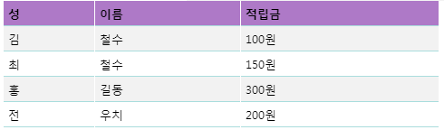
opacity
요소의 투명도를 조절하는 속성
0 ~ 1 사이의 값으로 조절
opacity 예제)
<head>
<style type="text/css">
body {
    background-color: rgb(81, 0, 156);
}

img {
    opacity: 0.5;
}
img:hover {
    opacity: 1.0;
}
</style>
</head>
<body>
<img src="Penguins.jpg">
</body>
visibility, display
화면상에서 요소를 보이게 하거나 숨기는 속성
| visibility | hidden 자리는 유지하되 안 보이는거 |
| display | none은 공간자체도 아예 없어지는거 |
visibility 예제)
<head>
<meta charset="UTF-8">
<title>basic</title>
<style type="text/css">
.v1 {
    border: 1px dotted red;
    visibility: hidden;
}
.v2 {
    border: 1px dotted red;
    visibility: visible; /* 기본 값 */
}
.v3 {
    border: 1px dotted red;
    display: none;
}
</style>
</head>
<body>
<div class="v1">
    <img src="zz.jpeg" width="100">이미지1
</div>
<div class="v2">
    <img src="zz.jpeg" width="100">이미지2
</div>
<div class="v3">
    <img src="zz.jpeg" width="100">이미지3
</div>
<div class="v4">
    <img src="zz.jpeg" width="100">이미지4
</div>
</body>
display
보여지는 형식을 변환하는 속성
| none | 화면에서 요소를 제거(자리도 같이 제거) |
| block | 블록 요소를 변경 |
| 나머지 부분이 밀림. 전체 문장에서 두가지만 블럭 요소로 변환이 되어서 처리됨. | |
| inline | 요소를 인라인 요소로 변경 |
| 가로 세로 변경 값이 적용되지 않음(span에서 적용되지 않음) 줄의 기본적인 간격 그대로 유지됨 | |
| inline-block | 요소를 인라인 요소로 변경하면서 블록 형식도 같이 가지도록 지정 |
display 예제)
<head>
<style type="text/css">
span.a {
    display: inline; /* span은 기본값이 inline */
    width: 100px;
    height: 100px;
    padding: 5px;
    border: 1px solid blue;
    background-color: rgb(180, 67, 255);
}
span.b {
    display: inline-block;
    width: 100px;
    height: 100px;
    padding: 5px;
    border: 1px solid blue;
    background-color: rgb(86, 84, 218);
}
span.c {
    display: block;
    width: 100px;
    height: 100px;
    padding: 5px;
    border: 1px solid blue;
    background-color: rgb(102, 179, 252);
}
</style>
</head>
<body>
<h1>display 속성</h1>
<h2>display: inline</h2>
<div>Lorem ipsum dolor sit amet, consectetur adipiscing elit. Vestibulum consequat scelerisque elit sit amet consequat. Aliquam erat volutpat. <span class="a">Aliquam</span> <span class="a">venenatis</span> gravida nisl sit amet facilisis. Nullam cursus fermentum velit sed laoreet. </div>
<h2>display: inline-block</h2>
<div>Lorem ipsum dolor sit amet, consectetur adipiscing elit. Vestibulum consequat scelerisque elit sit amet consequat. Aliquam erat volutpat. <span class="b">Aliquam</span> <span class="b">venenatis</span> gravida nisl sit amet facilisis. Nullam cursus fermentum velit sed laoreet. </div>
<h2>display: block</h2>
<div>Lorem ipsum dolor sit amet, consectetur adipiscing elit. Vestibulum consequat scelerisque elit sit amet consequat. Aliquam erat volutpat. <span class="c">Aliquam</span> <span class="c">venenatis</span> gravida nisl sit amet facilisis. Nullam cursus fermentum velit sed laoreet. </div>
</body>
배경 이미지 넣기
url("파일명");
위쪽에 띄어져야하는 이미지를 먼저, 작은 이미지를 뒤에 작성해줌
배경 이미지 넣기 예제)
<style type="text/css">
body {
    background-image: url("그림1.jpg"), url("그림4.png");
    background-repeat: no-repeat, repeat-x;
    background-position: center, left top;
    background-attachment: scroll, fixed;
}
</style>
</head>
<body>
<h1>a</h1>
<h1>a</h1>
<h1>a</h1>
<h1>a</h1>
<h1>a</h1>
<h1>a</h1>
<h1>a</h1>
<h1>a</h1>
<h1>a</h1>
<h1>a</h1>
<h1>a</h1>
<h1>a</h1>
<h1>a</h1>
<h1>a</h1>
<h1>a</h1>
<h1>a</h1>
<h1>a</h1>
<h1>a</h1>
</body>
'HTML5 CSS3' 카테고리의 다른 글
| 0519 HTML/CSS - gradient, font, transform, transition, transition-timing, line-height (0) | 2020.05.19 |
|---|---|
| 0515 HTML/CSS - 문자 선택자, 박스 모델/여백(안쪽, 바깥쪽)/내용 관련/그림자 속성 (0) | 2020.05.15 |
| 0514 HTML/CSS - 일반 속성 선택자, 가상 선택자(반응 선택자/구조 선택자) (0) | 2020.05.14 |
| 0514 HTML/CSS - 기본 선택자(전체/태그/클래스/아이디/속성), 인라인/내부/외부 스타일 (0) | 2020.05.14 |
| 0513 HTML - input이 아닌 입력 태그 (0) | 2020.05.13 |